First Semester
Kevin Bacon
I drew Kevin Bacon because he plays in a lot of movies that i like. such as Death Sentence, Tremors, and X-Men Origins First Class. I feel like the drawing had a lot of potential until i attempted to shade the drawing. i honestly don't feel like i did a very good job on the shading but other than that i feel like the drawing has very good potential. i feel like I captured his emotion in my drawing. I just don't feel that I do well with shading or adding value. (No image sorry)
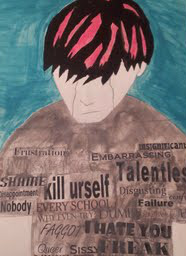
Anti-Bullying Project
for this particular project I needed to select a topic that I felt was very important. And I chose the topic of bullying because I feel like every school no matter how big or small rich or poor every school has that problem and it needs to stop. i decided to use really pail light colors just because i wanted to create that sad and deep mood. I also used a pail pink color to kind of point out that the guy i painted was different and he expresses himself in a different way then everyone else. the words on his shirt were also the requirements for the project but the words are also supposed to be the things that he is labeled with. because with bullying you can be labeled a "Freak," a "Faggot," a "Queer," a "Retard," these words can truly effect a person's life and u see it on my painting when he cries.
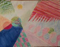
Abstract Painting
I used water color for a majority of this painting because that was the requirements for the project the rest i did in colored pencil. i think i had a good color balance though. i kept all the cool light colors on one side of the painting my only regret is putting all the warm colors on one little section of the painting (top right section).
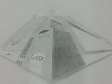
Vanishing Point/town poster
For this project we were required to make a 3-D town/city and align them up with vanishing points. I really liked doing this because drawing 3-D objects is something i am comfortable with. My town is pretty much a bunch of candy stores put in one town. I call it "candy land." i think i did really well but it definitely isn't my best work. i wasn't too worried about making it perfect and precise, i was more concerned about being creative and just having fun drawing it (because if I try to make something perfect i end up pulling my hair out. and that's not very fun.) and I did enjoy this project it was lots of fun in my opinion.
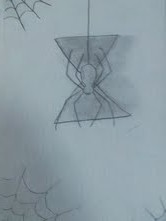
Widow Sketch
This is my very first sketch of the year and for me it's the most frustrating. Because for this sketch I tried to make everything perfect about it and it just doesn't measure up to my expectations. I just feel like I could have done a much better job but it would have been a pain to start over.
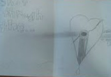
Shot through the heart Sketch
The reason i drew this sketch is because i had the song "shot through the heart" stuck in my head during study hall. I tried to get the blood splatter just right and i think I did a good job. But I'm not 100% sure how i could make it better. I'm not exactly a pro at drawing blood splatters. Over all I like how it turned out and I enjoyed drawing it.
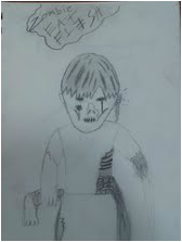
Zombie! Eat Flesh!
I drew this sketch in honor of the T.V. series: The Walking Dead. I just gave the zombie all the features that I believe a good zombie should have. his nose is bit off, you can see his ribs, his arm is missing, he's eating a limb. these are all good features for a good gory zombie and I really like good gory zombie movies :)
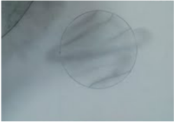
Space Sketch
When i drew this I really didn't expect it to turn out as good as it did. I was delightfully surprised with it. I was just trying to be creative and draw something knew that I haven't before and it turned out really nice. I feel like I did a really nice job with it and I honestly don't think I need any improvement with it. this is one of my favorite sketch's.
Second Semester
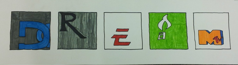
Logo project
for this project we needed to make an inspiring or encouraging word out of logo designs. i really like the way my project turned out. i think it's very colorful and i think i did it very well. i am very satisfied with how it turned out. the first letter is a 'D' from the DC shoes logo. the second letter is an 'R' from the pharmacy logo. the third letter is an 'E' from the EA sports logo. the fourth letter is an 'A' from the Amp energy logo. the final letter is an 'M' from mtv. all these letters in order spell 'dream'.
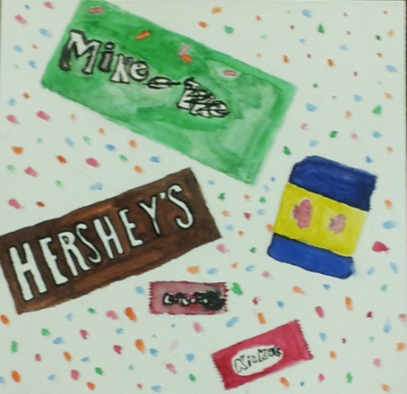
Candy wrapper project
for this project we needed to draw candy wrappers and then paint them with water color. this was very frustrating to work on. i cant get as detailed with a paintbrush as i can with a pencil. and for me it is just very frustrating trying to get detailed. but i think i did very well for my standards. it's very colorful and you can tell what it is when you look at it so this was a success for me.
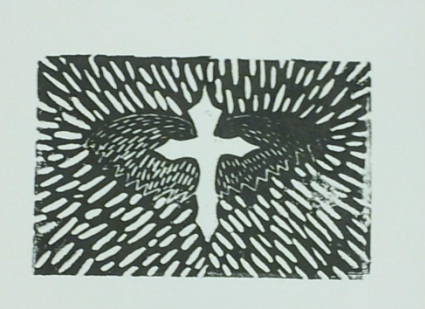
Cross ink print project
i really like the way this one turned out. how ever i think i could have done a lot better but a lot of people seem to really like it so i consider this a win.
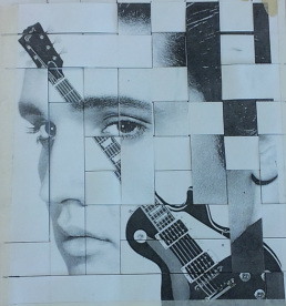
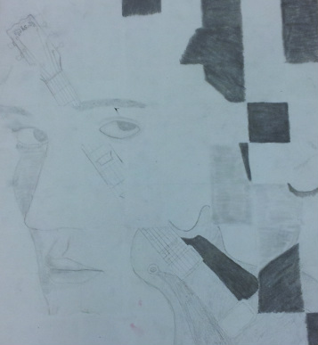
Elvis and guitar (checker board)
this project is really special to me just because i thought of it as a good opportunity to make something for my sister. she's obsessed with Elvis and i just drew this for her. making it into a checker bored type thing was part of the project i think if i didn't have to make it checker bored i think it would have turned out a lot nicer. but i had fun making it for my sister. she means a lot to me.